Creative Counterparts: A Chat With Craig & Karl
/Craig & Karl's new designs for Kiehl's take inspiration from "all sorts of random places," from which they "Frankenstein" these influences into tapestries of icons in Craig & Karl fashion - vivid, with unrestrained color and almost comic appearance.
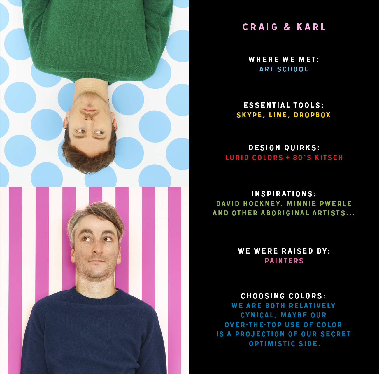
Raised each by painters, Craig Redman and Karl Maier later met at the Queensland College of Art where they developed a unique bond: as co-creators, sharing ideas, perspectives, and a quirky personality. This is part of what makes them such an indomitable collaborative force in the art world. With time, they found a degree of popularity, and more work, oftentimes collaborating with major brands. So too came a more advanced clientele - covers of Vogue and New York Magazine, designs for Converse and Nike, and myriad other collaborations - which allowed them freedom to choose projects that mirrored their artistic sensibility.
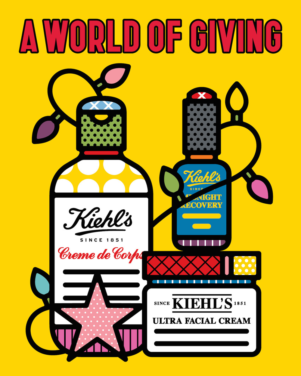
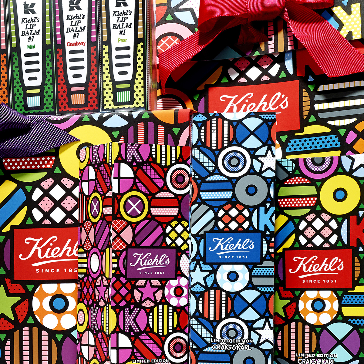
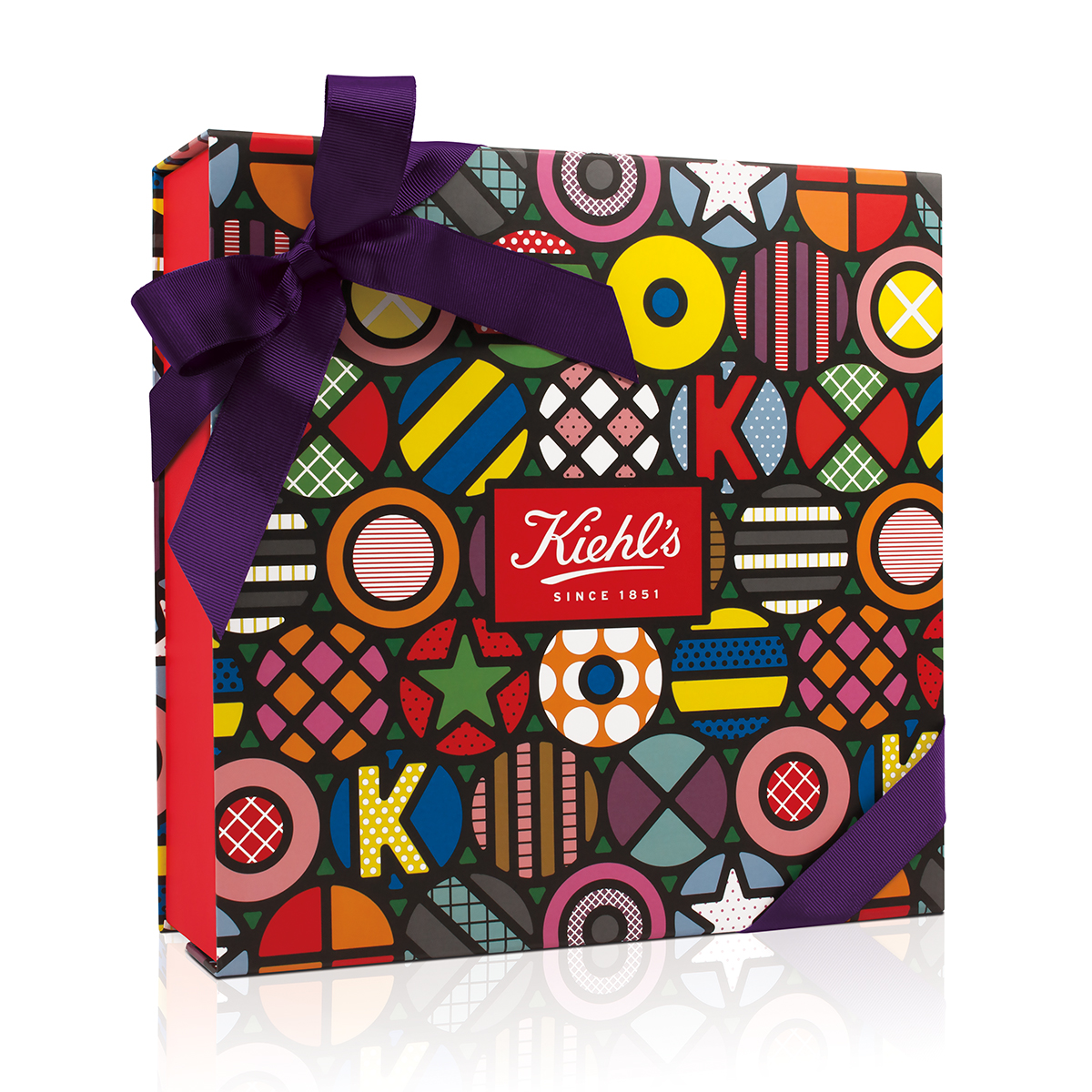
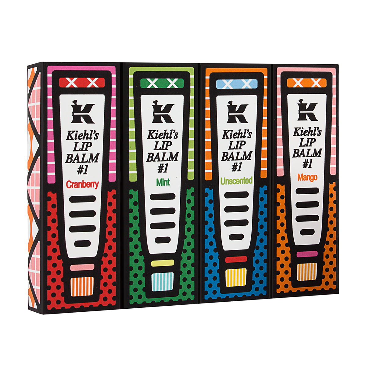
Their latest project is a collaboration with Kiehl's, the cosmetics brand started in 1851 as "Brunswick Apotheke" in New York's East Village. The company was purchased in 1894 by John Kiehl, and has since grown from an old-world apothecary into the now global brand Kiehl's. The collaboration features special edition label design and product packaging pervaded by imagined icons. These vary between inverted nuclear symbols, latticed pies, seed-speckled strawberries, and multiple other spherical iterations. The designs share many parallels with aboriginal art - the use of symbols, repetition of shapes and icons, along with the neat, bold outlines and sense of caricature that often predominates in pop art. Ultimately, the pieces reveal the kind of adaptive and novel approach to design that mark Craig & Karl as a primo collaborative team. And if that isn't motivation enough, Kiehl's has committed to providing proceeds of these limited edition lines to the charity Feeding America to help combat hunger during the holiday season. You can find the products at Kiehl's website.
K: Can you describe your path to becoming the artist you are today? Are there ways in which you've had to transform and adapt as an artist? Do things change as Craig & Karl becomes more well known?
Karl: Craig’s dad is a weekend painter and my grandmother started taking me along to her painting group when I was about 4 years old; consequently we both had an early introduction to doing creative stuff. We met in the first year of art college where we studied design. Over time we moved into illustration, then art direction, installation, and painting. We’re happy to shift our focus as our practices changes, as it enables us to be more flexible with the outcome of a project.
K: How did you first meet?
Craig: After we met in college, we pretty much worked on everything together . . . and have continued to do so, in one form or another, ever since. We now live in different cities - New York and London - but we know each other well enough that we have a good understanding of how the other works. We respect each other's opinion immensely. Because of this we can make quick decisions about things, and make stuff actually happen.
K: So you and Karl work in separate parts of the world, collaborating on a daily basis on projects from window displays to product labels to animated shorts. How are you able to work in two different countries, each with your own unique aesthetic context, and still put out a distinctly recognizable product?
Karl: Thanks to the wonders of Skype, Line, and Dropbox it’s pretty easy. We’re efficient with our crossover hours. We often take turns passing artwork between ourselves to speed things along, as well as to get a new perspective. We get each other almost instinctively, which makes operating in different cities across the Atlantic workable. Every project starts as a conversation between the two us: we kick around ideas until we feel like we have something that can be developed further. Generally, we can get a pretty specific idea of what we want to do just by talking it through. Then, usually one of us will start working on something tangible which we'll then kick around some more, working out the kinks until we've got something we're happy with.
K: Craig & Karl's most recent collaboration is holiday packaging for Kiehl's. How did you get the collab with Kiehl's and what did this particular design process looks like?
Craig: It started with receiving an email from the creative team at Kiehl’s. We’d seen their previous collaborations with Jeff Koons and KAWS and always thought it would be a dream project to work on. Once we started chatting with their team, we realized they were up for pretty much anything so it made total sense to agree to the project. Our initial influences were from all sorts of random places - a piece of Kiehl’s history, an exhibition we saw, something said on a reality show - and bits of these abstractly triggered new ideas. We absorb a lot of different things and Frankenstein them together in our own way. Then we back-and-forthed ideas with Kiehl’s until we settled on a concept - from there it’s all about how we make that idea work for each application.
K: Can you tell us about your inspirations - the artists, designers, and images - that first influenced your work, and most recently your Kiehl's collaboration?
Karl: David Hockney probably stands out as a studio favorite. We’re also super into Tauba Auerbach, Jonas Wood, Korakrit Arunanondchai, Martin Creed, Jayson Musson, Olaf Breuning, David Benjamin Sherry, Takashi Murata, Urs Fischer, Matt Connors, Laura Owens - we could go on...
K: You use a lot of bright hues in your work, melding into textures and color blocks that both pop out and feel stylish. How do your personalities show up in your work?
Craig: Growing up in Australia in the 80’s was a very bright, very kitschy place, so this probably explains where our obsession with color comes from. A lot of Australian artists and designers in particular influenced us growing up, particularly Howard Arkley, Ken Done, Jenny Kee, Albert Tucker, as well as different aboriginal artists like Minnie Pwerle and Timmy Payungka Tjapangati. We have been playing with color since the beginning of our careers, so we’ve become pretty practiced at what works and what doesn’t. We have a relatively consistent palette, mostly of pretty difficult, lurid colors - we enjoy the challenge of figuring out how to make one sit with another. We are both relatively cynical, maybe our over-the-top use of color is a projection of our secret optimistic side.
K: In one word, what does your workspace look like?
Karl: Asylum.
K: What does it mean to make art for a product? Is it cross-referential, with product informing design, and vice-versa? Or is it more like each product or opportunity is a new challenge, a new opportunity to bend design to the task at hand?
Karl: In our practice art and design go hand in hand. There is constant consideration for what the visual could be as well as how it will work with, say, a product. We are lucky to have been given a great deal of freedom but it’s still a collaborative process [between artist and company]. Even if we are in the driver’s seat so to speak, we want to ensure it represents both the artist and the brand. It’s made easier by working with companies that match well with our own approach and aesthetic.
K: Your art has a great sense of humor, oftentimes turning a word, phrase, or familiar face into something iconic, amusing, even wacky. Do you think this humor - which audiences really connect to - is part of why your work is desired by the likes of Google, LVMH, and Nike?
Craig: Sure, we’re Australian and Australians have a particular sense of humor which makes for a good perspective on things. It gives us our own point of view, for better or worse. We often use humor in our work, whether a visual pun or a strange use of color that prompts a double take. I think part of what makes our work appealing is because it has a personality. It doesn’t take itself too seriously - kind of like a friend making a joke at your expense.