Clavel Arquitectos Designs Casanueva Farmecia!
/When You're feeling under the weather, wouldn't it be nice to retrieve your medicine from a "feel good" high styled pharmacy? Spanish based firm Clavel Arquitectos, took the basic idea of a traditional pharmacy and created a futuristic atmosphere in Murcia to help their clients stand out in their overly saturated drug market.
Casanueva's Pharmacy is now getting world wide recognition in the design world for implementing architecture and design into their company's philosophy. For Casanueva, their store's environment was so important to them that they contracted Clavel, a team known best for their colorful and creative commercial architectural spaces, to construct a unique and fresh shop.
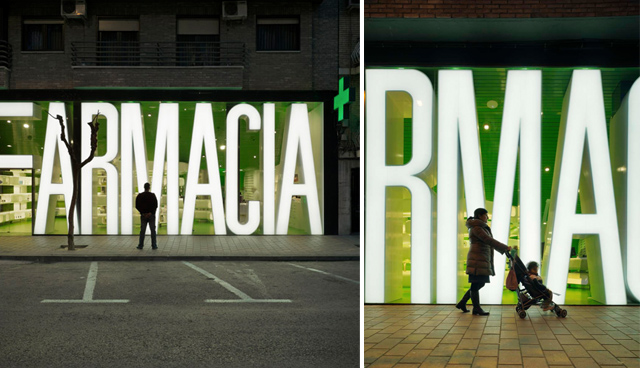
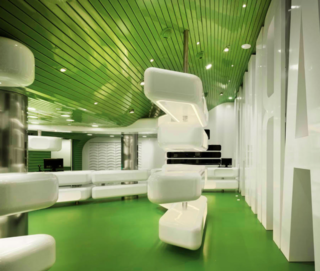
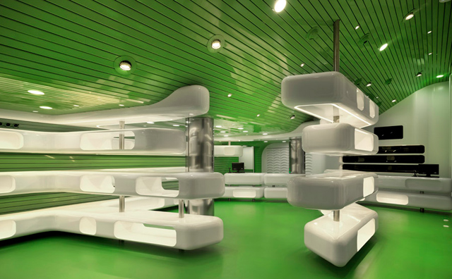
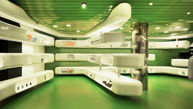
Clavel decided on the dominant use of two colors, Chemist Green and White, which would wrap throughout the entire space. In order to meet strict deadlines Clavel's design demanded for it to be 95% prefabricated. The facade of the shop has floor to ceiling letters spelling the word "Farmacia." These large letters were chosen to add protection from the sun because the window is North West facing, and to instantly suggest the use of the store to the public. The letters also serve a dual use in their functionality, acting as a light source from the outside and storage/shelving from the inside. The interior flooring is covered with green epoxy resin and the prefabricated tubular white metal units float throughout the space providing display shelving for the store. Energy efficient LED lighting is used in underneath the white units to achieve a visual floating effect. Another interesting feature is the rotating sales desk which allows a wall to open to a back of house laboratory!
Photographer: David Frutos


