Phosphorescent Fables: Aesop Stuttgart Store by einszu33
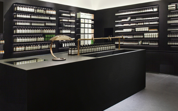
/Munich's einszu33 designed the second signature store in Germany for high-end Aussie beauty product retailer Aesop with French minimalist peintre du noir Pierre Soulages as inspiration. Focusing on a directive of "black but not dark" the design team employed a palette of charcoal grey and off-white that also references the brand's simple and distinctive product labels.
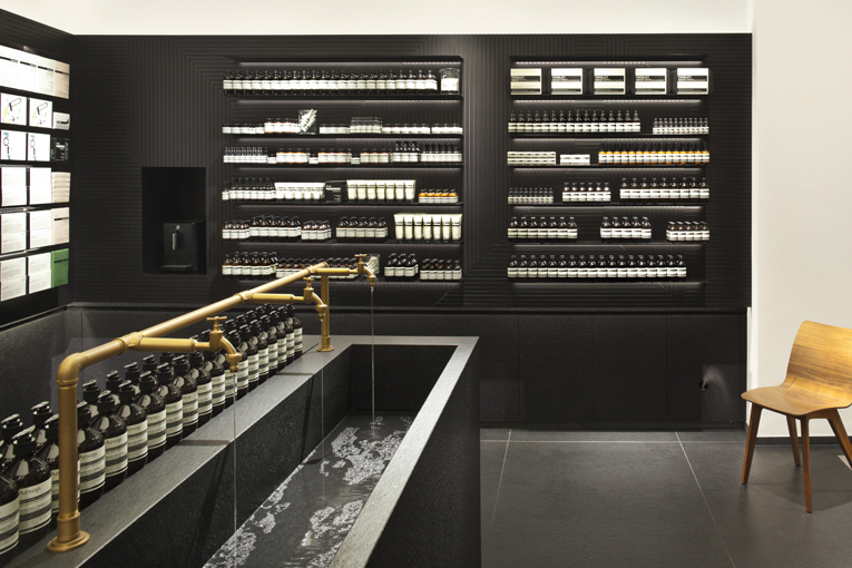
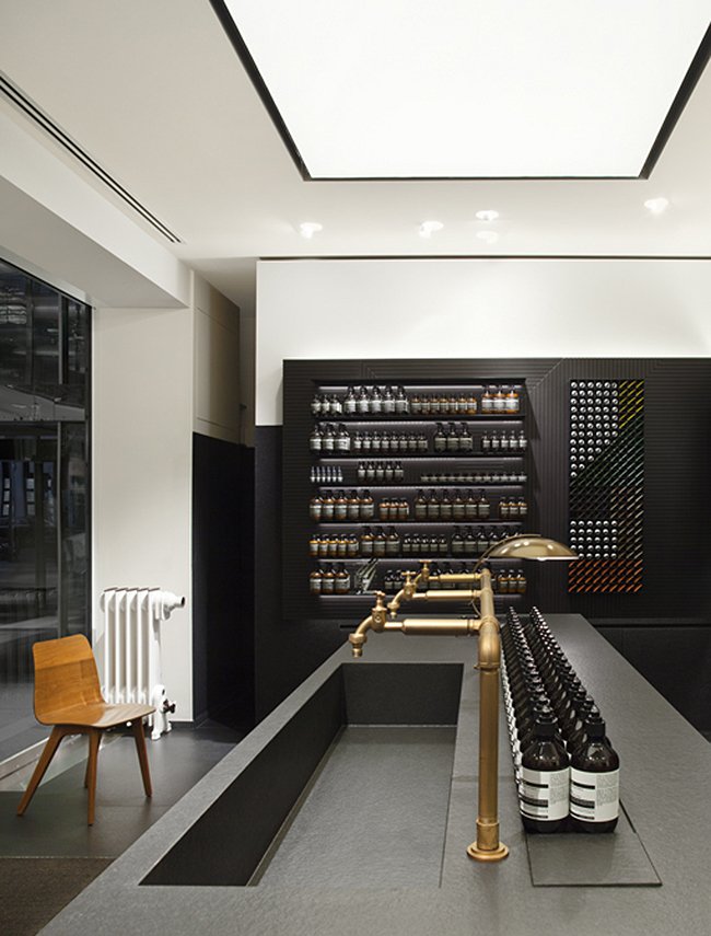
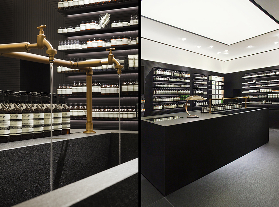
Paradoxically, Soulages paints in black in order to work with light. By using different mark making techniques he enables light to reflect off the surfaces of his black paintings in varying patterns and striations creating luminous, shifting color. einszu33 found their interpretation of this phenomenon in the vast central counter of Aesop at Stuttgart. Made of Nero Assoluto black granite and stone, the island houses an elongated demonstration sink and sits beneath a glowing lighted panel in the ceiling. The smooth stone and precise edges generously create a warm interplay of light and shadow, and water splashing into the basin from simple brass plumbing completes the rainbow of hues to be found in simple black and white.
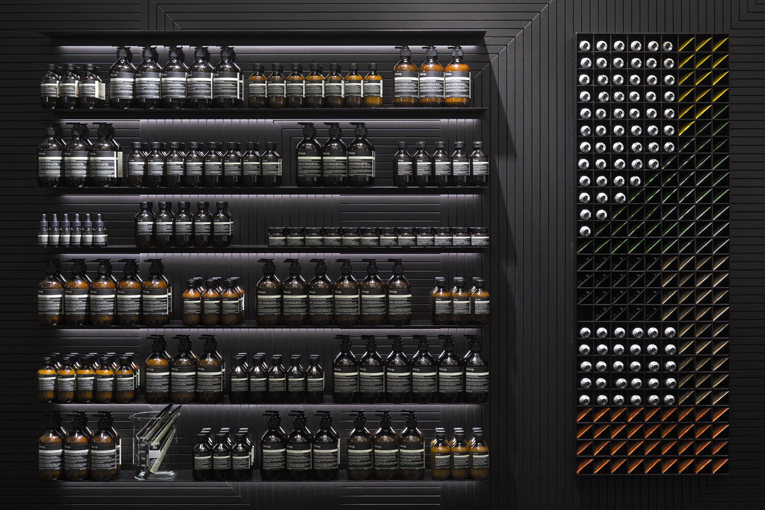
Surrounding the bookish shelves that house meticulously ordered rows of Aesop's skin, hair, and body products, are walls clad in milled black MDF paneling featuring linear incisions that recall Soulages' definitive Outrenoir series. Overall the space is clean, concise and sober with the air of an overtly modern apothecary, but is subtly warmed and made familiar by accents of wood, felt, and brass.
Since it's inception nearly 40 years ago, the brand philosophy of Aesop has been firmly rooted in intellectually whimsical and artistically rigorous endeavors through support of emerging writers, and conscientious design of retail spaces. With the help of einszu33 they have continued the tradition at their newest location by paying homage to a visionary painter of light.
Photography courtesy of Aesop
Related stories:


