Oldie But Goodie: Uncovering Italy's Coveted Teatro Regio
/Through the doors of Torino opera house Teatro Regio is a design spectacle that rarely appears in either print or online photographs but rivals modern feats of interior aesthetics in magnificence and innovation, so much so that we have taken a slight detour from covering breaking design news to do an exposé on this vintage beauty that has been virtually unseen by the public, save those who’ve actually been fortunate enough to intake it in person. A history of renovation has saved the eighteenth century Teatro Regio from becoming a mere historical relic, the most recent of which was undertaken by the late Carlo Mollino in 1967, after it was destroyed in a 1936 fire. Photographer Maxime Galati-Fourcade snaps an impressive selection of shots that captures this gorgeous space from all the right angles.
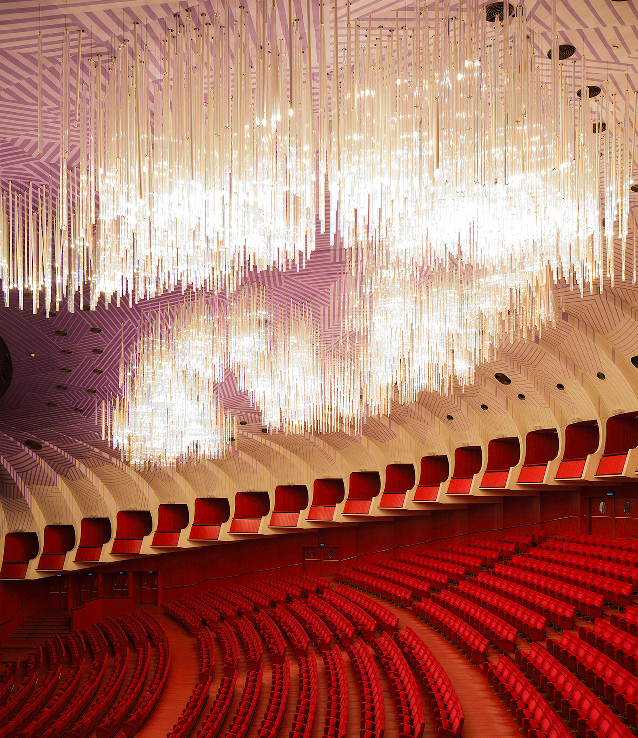
Mollino’s interior infuses the otherworldly into the modern and with a Dantesque audacity, striking our senses with infernal reds in the carpet, wood flooring, and upholstery that are matched by the paradisal swirls on the walls of the theater proper, which coalesce into the breathtakingly divine chandelier whose own swirls–luminous and inversely tiered–are oriented choir-like into an angelic host of bright glass fixtures that adorn the interior while directing guests attention, in the interims or intermissions, properly upward. Once eyes are centered above, however, perception is altered again, as separate panels with black and white lines are placed side by side creating an innovative, dadaist checkerboard design.
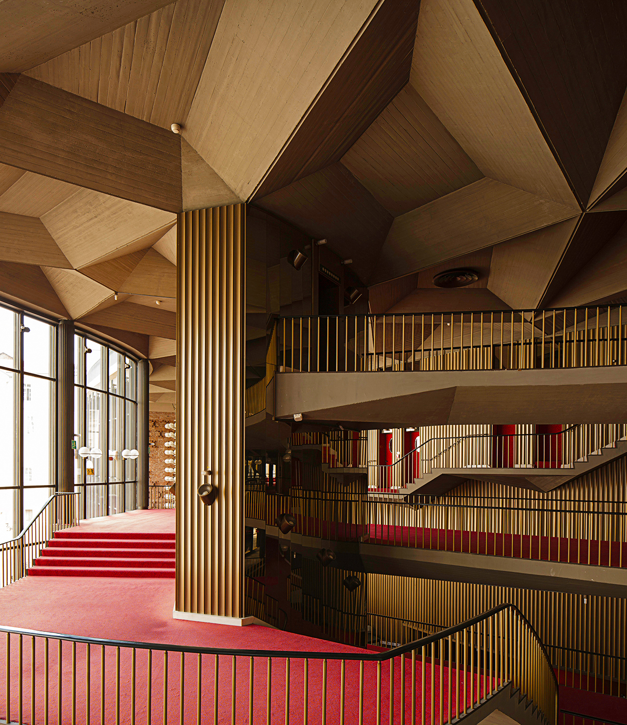
This sort of perceptual misdirection appears to be a hallmark of Mollino’s redesign, but the genius resides in it’s multi-varied occurrences. There’s a verticality to the grooves along the walls, which is paralleled in the spokes of the railings, a nice one-two punch that’s thrown off balance by the uppercut that is the roofing: traditional convex cavities that perhaps typified the original iteration of the theater are retained, but given a modern redux of strict lines and geometric shapes. Mollino is faithful to straight axes but uses them to confuse, then please, the perceptions of theatergoers socializing in the lobby and reception areas.
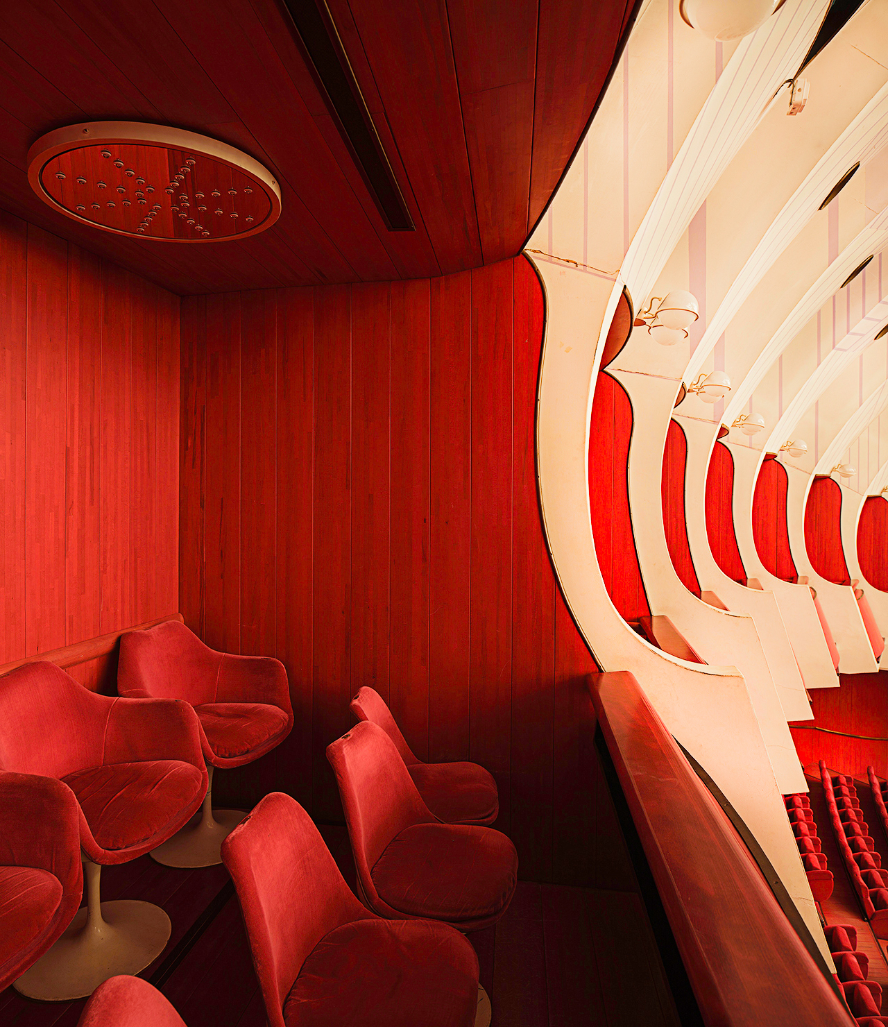
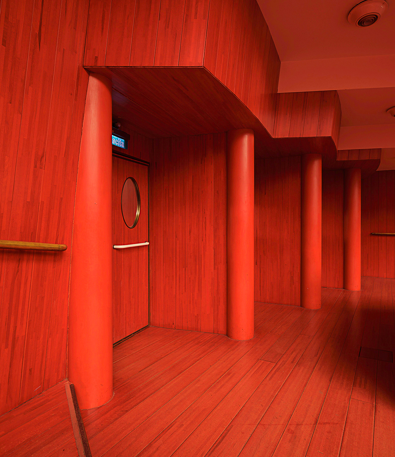
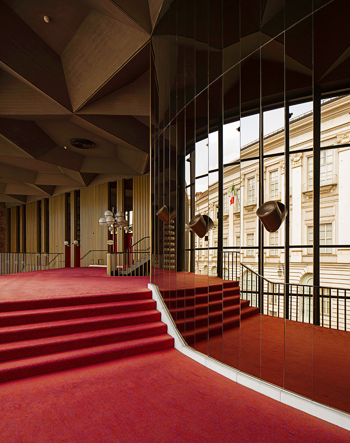
In essence, Teatro Regio’s visual pleasure lies in the surreality of the design, a surreality that wouldn’t be out of place in a David Lynch picture, which the use of red truly indicates. It’s one thing to have red carpets but quite another to don the entire theater entrances, both doors and walls, the same color, and one can almost feel their impressive glare from simply gazing at Maxine Galati-Fourcade’s photographs. The lusciousness of this color is never oppressive, but always remains seductive, which is to say that it’s robust but never overused; especially since it contrasts so beautifully with other elements both of the design–and of the city itself. Torino is readily viewable, from the levels of the mezzanine-like balconies and staircases, through the large windows, the classical facades right outside the glass forming walls of their own design spectacles that imprison the theater and truly contrast with the (post)modern interior. Directly opposite one such view is an enormous mirror that increases the pleasure even as it legitimizes the “post-” prefix.
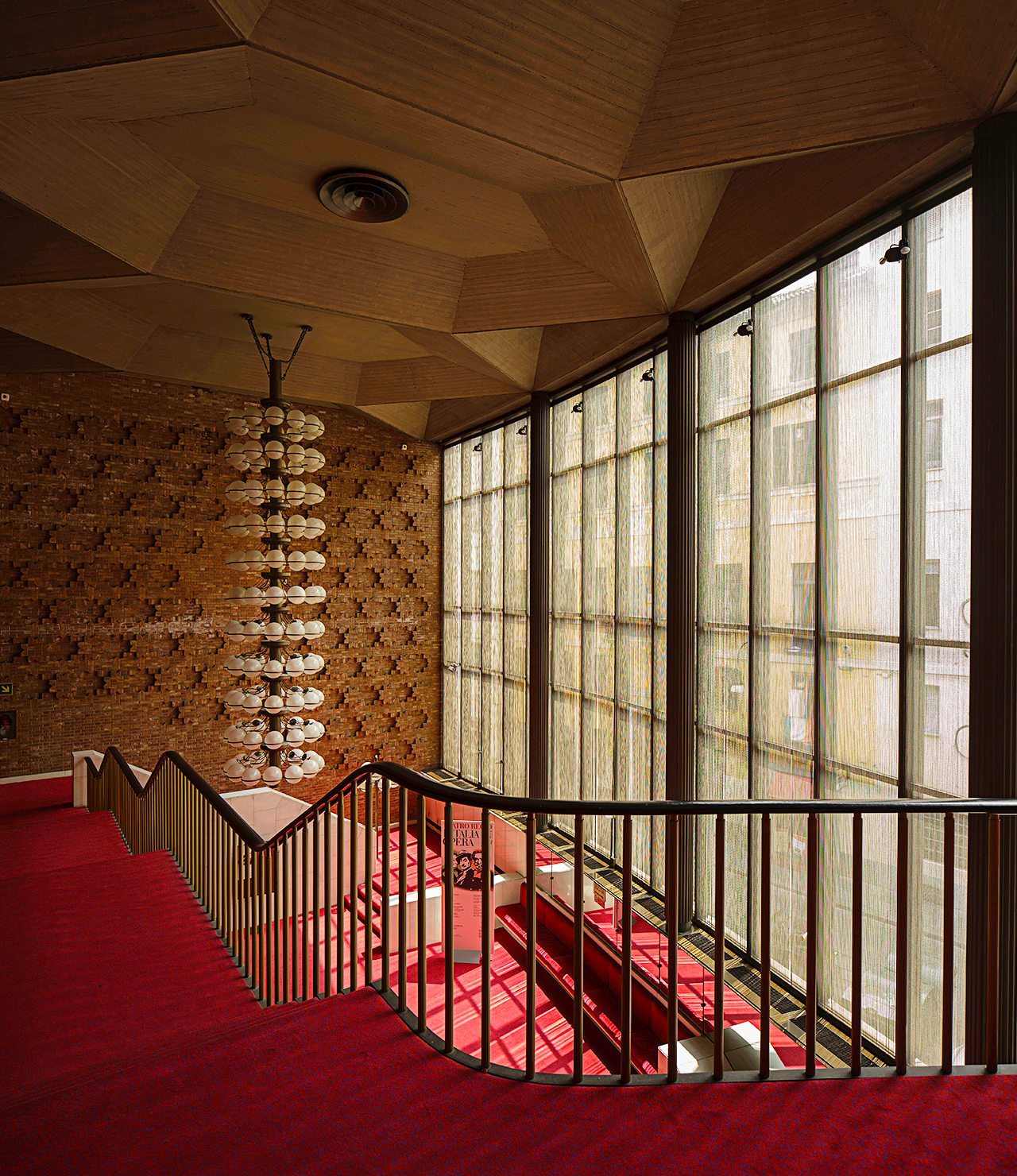
A truly total experience of Teatro Regio lies not in any single aspect of its design. Majestic as they all are, it is their intimate confabulation that speaks most directly to the heart of the architect extraordinaire, the design enthusiast, or the average opera attendee. Swirls might hypnotically revolve into an angelically luminous sublimity in the theater proper, but in the reception area a brick wall is amazingly pixilated into three dimensional crosses. And while the chandelier boasts inverse spires, the one hanging in front of this brick wall is composed of eleven circles of spherical bulbs suspended one on top of the other.
The dialogue between such widely differentiated design elements is intensely passionate, a fact for which the colors are directly responsible. The white tones only achieve their darkest accents in light grays, and readily form a canvas of innocence onto which experience, in the person of the red, stains the white with the beautiful and tragic desires of the human experience: what is occurring on stage in the scenery and the music is literally occurring in the walls of the theater, as well.
The classical elegance is maintained in the new design but in a fashion that comprehends and communicates the current, all while remaining in operatic dialogue with the human experience from both an empathic and an aesthetic angle. The geometries amazingly appear both classical and current, as if a Cathedral triptych were to have its angles absurdly re-positioned and its story replaced by an evocative interplay of colors that might say more about ourselves then any religious iconography could–and this is only a single impression in an architectural beauty that boasts a slew of unique, interacting elements. It’s enough to ensure that a new visual experience will be proffered upon each successive visit to Teatro Regio, proving that this is a design that ages very well indeed.
Photography by Maxime Galati-Fourcade
You might also enjoy:


