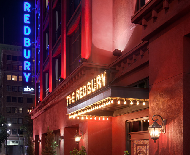
Behind The Redbury Hotel With Matthew Rolston
/“Romantic. Soulful. Imperfect. Funky. The ultimate hangout for the young and creative.” Creative director Matthew Rolston describes his newest creative endeavor, the Redbury Hotel. Rolston aspired to curate a space that would “appeal to a young, creative crowd and for the design experience to feel ‘theatrical’, a little bit like actually being in one of my photographs or music videos.” This spring we had the pleasure of taking a tour of the Redbury from famed photographer Matthew Rolston himself.
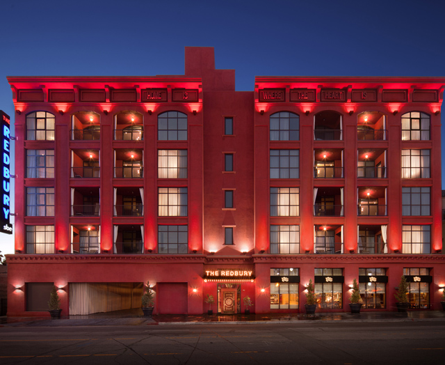
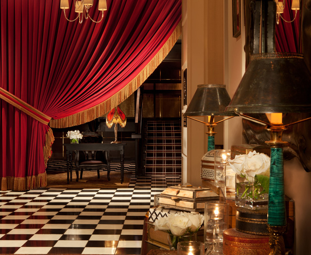
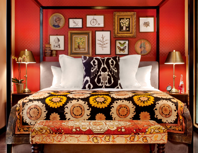
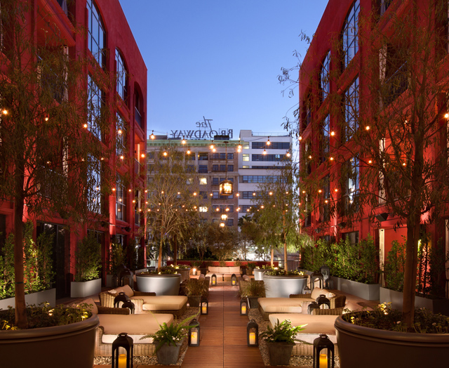
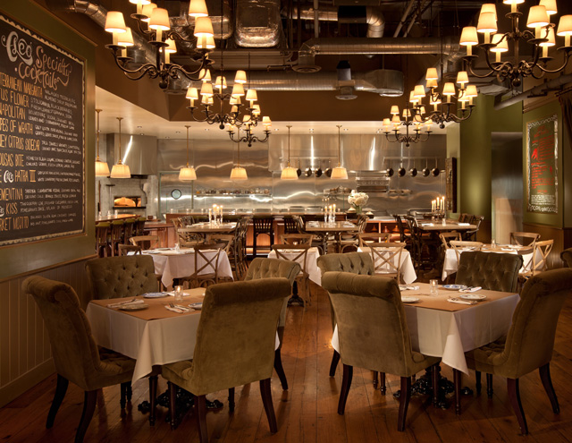
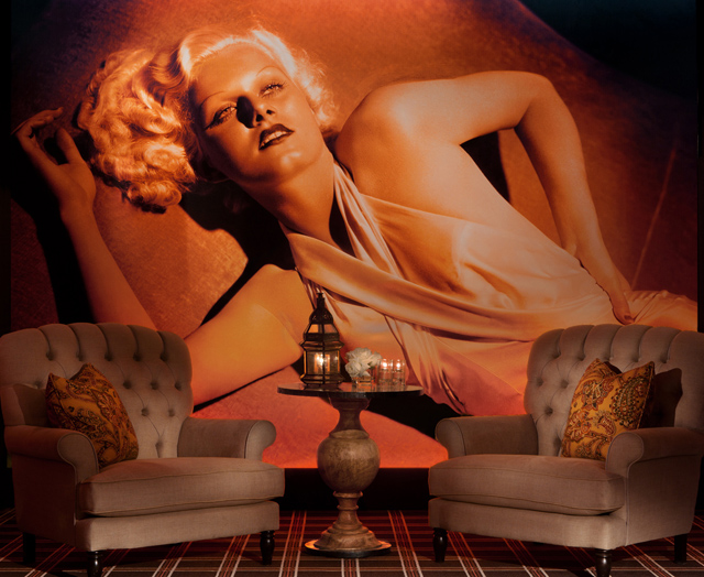
We got a sneak peek into a few of the divinely designed rooms that comprise the 57 room boutique hotel. Swathed in gorgeous photography, eclectic collections of pinned butterflies, pleated silk lampshades, and 'moss' fringe trimmings, there is an abundance of whimsical, theatrical elements that breathe life throughout the space. The hotel buzzes with a beautiful symphony of colors and textures, elaborate paisley wallpapers, distressed leathers and linens, 'antique' style cotton velvets, and vintage Turkish and Persian carpets. Walking though the space you can’t help but feel a relaxed, understated sense comfort and sophistication, with unsuspecting surprises of edgy elegance, old Hollywood glamour, and bohemian flair.
Rolston reflects on the unique name that inspired the hotel on Hollywood and Vine. “The naming of the property is its most powerful branding device. It's called The Redbury for a number of reasons. First, because the building I "inherited" was painted scarlet red. Secondly, because the word Redbury, to me, is reminiscent of 'Ashbury', as in Haight-Ashbury, thereby evoking images of a hippie-era bohemian eclecticism. Also, I believe, it speaks to the brand's target audience, namely the young, the creative, the musically-oriented.”
In discussing his depth of involvement Rolson explains, “This project was acquired by Sam Nazarian (Los Angeles-based developer and head of SBE Entertainment) from its original developer in a nearly completed state. Mr. Nazarian wanted to put his own stamp on the place. My assignment was to work with as much of the existing conditions as possible, or at least adapt to them. He asked me to review every aspect, from naming to brand positioning, color codes to employee costumes, literally every aspect - from the 'landscape' to the 'soundscape' to the 'scentscape' to the 'fire escape'.”
In reflecting on his inspiration behind his decadent designs, Rolston elaborates, “The ambiance is meant to convey the warmth of a townhouse, with a touch of Rock-n-Roll cool and a sense of Hollywood history. It is, after all, at the famous intersection of Hollywood and Vine, - directly across the street from the iconic Capitol Records building. Again, more like a townhouse than a typical hotel. We wanted guests to feel comfortable, relaxed, and at home, but also convey an exciting sense of destination.”
A photographer first and foremost, Rolston took the utmost care and consideration when creating the lighting scheme. “Light quality is very important to me. The hotel, hopefully, exudes a warm, seductive, and inviting atmosphere, and that is supported by the lighting design. From signature wall size back-lit photo murals, to illuminated walls themselves. A rich mixture of decorative lighting, especially chandeliers, pendants, and sconces, throughout. Light sources range from fluorescent to halogen, LED and even Edison-type filament bulbs, all in warm-toned color balances.”
We also had the pleasure of dining at Cleo, the hotel’s restaurant, enjoying a sumptuous spread of hummus, beef cheek tagine, grilled octopus, and lamb kebabs. And we must admit we enjoyed a few Honey Citrus Sidecars, an utterly intoxicating (both figuratively and literally!) blend of whiskey, Cointreau, crushed mint, yuzu juice and agave nectar. A must if you’re stopping by Cleo.
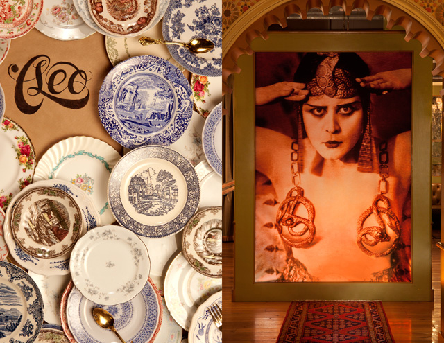
Rolston shares his inspiration for creating the restaurant’s aesthetic. "Cleo", the name of the restaurant in the hotel, was inspired by a famous photograph of Hollywood actress Theda Bara as Cleopatra from the 1917 film. There's a 10-foot by 10-foot backlit photo mural of this image that serves as a kind of "muse" for the restaurant and stands at its entrance as a visual icon. I helped name the restaurant, and created brand visioning for every element... from the logo to the tableware, even the candles. Every detail. The restaurant is very much a part of the fabric of the overall property experience, and yet it definitely has its own identity.” - Callie Griggs
Imagery Provided By The Redburry