Esrawe Breathes New Life into “Design House”
/Snapshot: Design Week Mexico has for six years conducted an annual project whereby an interior space is redone by a team of designers. This years offering is an organic interior space that dialogues directly with the past in a fluid, “alive” way designed by Esrawe.
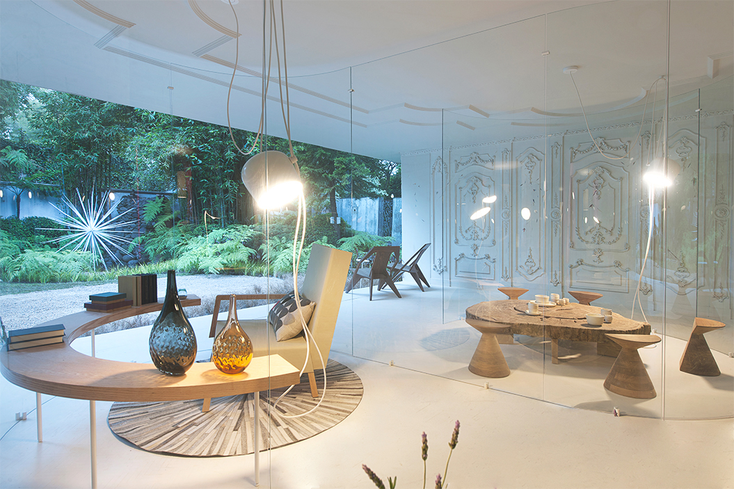
Now in its sixth year, Design House is an annual project sponsored by Design Week Mexico wherein a house in Mexico is submitted to a group of renowned interior designers who proceed to transform the inside. As in any house, there’s the interior and exterior--the living and the garden--areas in need of a design touch, and Esrawe Studio’s proposal is about redefining the house’s existing boundaries in terms of a living transparency and transcendency, instead of a lifeless demarcation and separation.
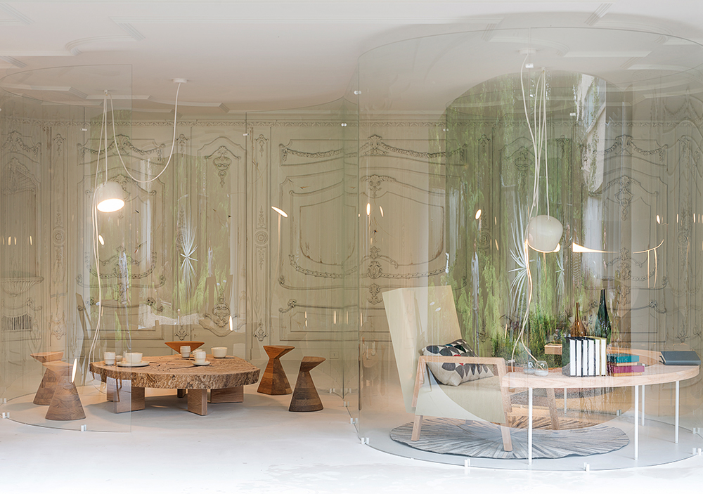
The gardens outside have been redone by renowned landscape designer Pedro Sanchez with warmth, exoticism, invitation, and hospitality in mind. The array of aromatic and attractive shrubbery encapsulates the allure of nature and domesticates it for private use. Inside, the living areas are positioned directly adjacent to the garden, for this area is intended to serve as a place of reading and contemplation, activities for which nature functions as a healthy catalyst. The final recessed area is a place of relaxation and hospitality for guests. These are the new frontiers that the original structure has been recast into, and they are separated by circular glass panelings, called by the designers a “glass skin,” that redefines the house’s standard demarcations in terms of the freedom offered by ocular transparency, as well as the organic quality of the curving glass panels, which ties directly with the flora visible through them in the garden.
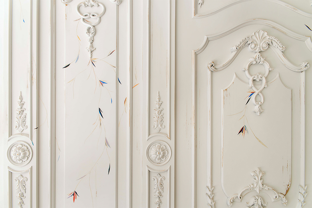
Certain elements of the original structure are kept intact, one of the most fabulous of which is the baroque-like floral moldings on the walls, which have been appropriated into the redesign with skeletal drawings and adhesive tapes of flowers that are tinted with shadowy but vibrant color. This is a very stylistic integration that preserves the original while touching it up with a contemporary style. The floral quality of course contributes in turn to the organic quality, which is enhanced uniformly throughout the interior in the figures of those curving glass veils of “skin,” but also in the overhanging lights, the chords of which dangle almost cybernetically from the roof.
Enhancements to the overarching themes of the organic and the modern are provided by artwork courtesy of Arroniz Gallery’s Omar Barquet. One of these pieces, called “Hedera,” was actually completed on site over the course of three weeks, conveying in no better way the “alive” feel to the interior, its process and its final appearance. Appropriately, the piece is of a flourishing ivy vine emerging from the garden into the interior.
This year’s Design House is a vibrant and organic dialogue with the past that looks to the future, reveres the past, and celebrates the present, of this interior space.
Photography by Jaime Navarro


