Passing Through: Intellectualism Meets Invigoration at Oxford Bookstore
/New Delhi’s Oxford Bookstore, the first interior project of Normal Studio’s design duo Jean-Francois Dingjian and Eloi Chafai, stands Western-styled bookstores on their heads while maintaining their devotion to intellectualism, albeit an innovative and dreamlike iteration of it. Prior projects of Normal Studio feature a repertoire of the same type of interrelating black and white shades that underlay the new bookstore on the macro level, and upon which vibrant hues are set via structural abnormalities like arches, or the simple binding of a colorful book.
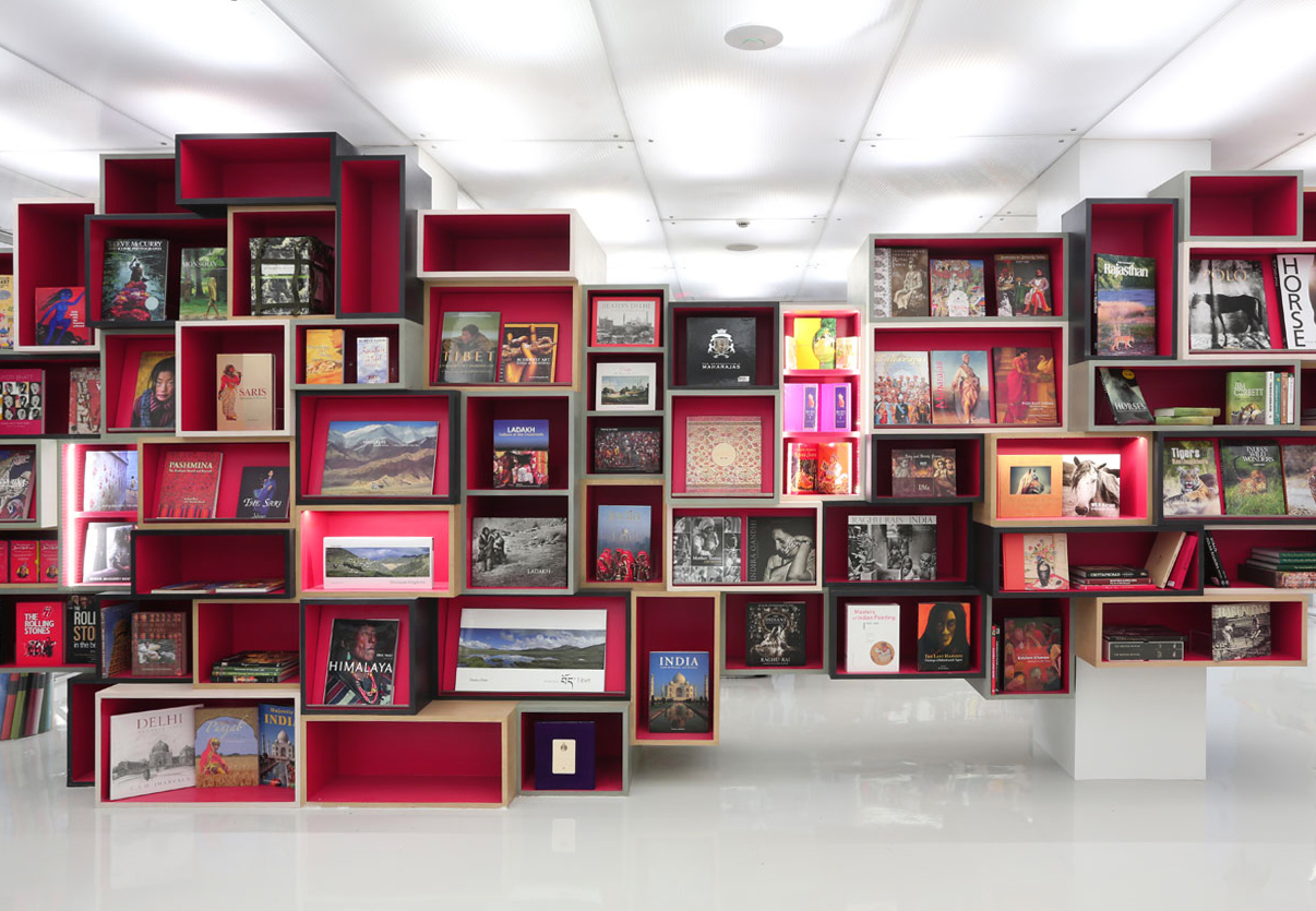
The neon fixture around which the entrance is constructed highlights the lighting dynamics that are such an important element in Dingjian’s and Chafai’s previous projects and are now thrust to the forefront of the Oxford Bookstore. The entrance to the remodeled classical architecture of the building in which the bookstore is housed features a wall of evocative words from literary works that are rendered in neon, and that impel visitors inwards to a book-lovers’ paradise accentuated by designs in which semantics are discarded in favor of immersion. The shelves surrounding the entrance are simple box-designs that hint at the more geometrical anomalies that occupy the central room, wherein boxes of varying shapes, sizes, and colors (all having red interiors, however) are stacked labyrinth-like in the middle of the room, and display larger-formatted volumes that are as functional for their colorful covers as they are for their words and images.
Neon is mostly absent from the rest of the building, but the interplay of artificial and natural auras is apparent throughout. The walls of the central room are lined with bookcases gradated from the darkest black at the bases to the brightest white at the top, before transcending the color spectrum entirely at the ceiling, where the white melds into an artificial light. Color is interspersed into the starkness of the graded grays via two elements. The first and most striking is the sequence of five vibrant blue arches under which visitors can pass into the Cha Bar. And while the blue directly contrasts with the grays, the majority of the color in the store is appropriately found on the covers and bindings of the books themselves, which is the second and more central element of infused color.
The effect created between shaded grays and the glossy dark blue of the arches is more apparent in the Cha Bar than in the shelved inner rooms. Inside the bar, polygonally arranged tables concentrate the white, and compliment the black wall, which is in turn complemented by the blue arches that are its insets. The Cha Bar is perhaps the most interesting room of the Oxford Bookstore perceptually speaking, and in fact, in all of its innovative intensity, it is also the paradoxical locus of the traditionally Western-austerity typifying bookstores from Boston to London: the few vibrant pigments of the bar, inserted into starker surroundings and coupled with the carefully filtered natural daylight, create an effect that is almost classical and definitely in line with normal bookstore thematics from an atmospheric standpoint. Arguably, the metal chairs aren’t the best frame to recline in over a relaxing read, but the windows offer more daylight than standard bookshop cafes, and they’re strategically positioned above eye level, which lets the daylight occupy more of the room’s volume while also preventing distractions from interfering with reading, conversing, etc.
The Cha Bar is not the only room in which artistic functionality takes precedence over comfort. The lecture room shares its elongated layout and its use of natural daylight with the Bar, and the two rooms also feature seating amenities which, though they are decidedly less than comfortable, manage to enunciate a distinct character quality of this bookstore more generally speaking: waylaying comfort provides room for innovation, which might be a bit more offsetting than inviting to visitors seeking the coziness of an environment suited to getting lost in an engrossing read. Indeed, the artificiality of the store upsets the traditional focus of Western bookstores, i.e. providing an intellectual yet warmly austere space that could as easily indulge a bookish pastime as it could facilitate academic pursuits. And while the Oxford Bookstore might allow for those traditional endeavors, its design-based version of normal bookstores is much more conducive to book buyers–not strictly to book readers. Much of the reason for this is found in the fact that the environment doesn’t necessarily orient itself around the attraction of homeliness, and instead emphasizes virtuosity and modernity.
The interplay of artificial and natural light, the interesting geometrical dynamics, and the relationship between stark grays and vibrant blues and neons, makes the store an immersive experience that nevertheless achieves the transitional quality that is the goal of Dingjian’s and Chafai’s design. Much more than a Western bookstore, New Delhi’s Oxford Bookstore is a gateway rather than a destination. The geometric continuity of the interior immerses visitors, but also ushers them along. It inspires visitors, yet encourages them to broach the world reenergized by that inspiration, not to let it achieve catharsis by remaining within its walls.
Photography courtesy of Normal Studio




You might also like:


